The Psychology Behind Colors in Graphic Design
Colors do more than make things look attractive, they influence emotions, shape perceptions, and drive user behavior. In the world of graphic design, understanding the psychology of colors is not just a creative choice, but a strategic decision that can impact how your audience interacts with your brand.
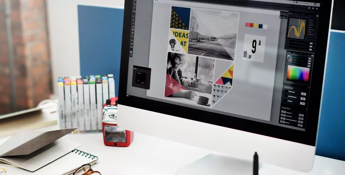
At Drenzi.in, a leading graphic design company in Coimbatore and Tirupur, we harness the power of color psychology to create visually compelling and emotionally resonant designs. This guide will help you understand how colors affect the mind and how to use them effectively in logos, branding, marketing materials, and user interfaces.
Why Color Psychology Matters Design?
- Triggers emotional responses:Different colors evoke different feelings, calmness, excitement, trust, urgency, etc
- Affects visual attention: Certain hues attract attention more than others and can guide users toward specific actions.
- Enhances brand identity: Consistent color schemes reinforce recognition and strengthen your brand’s personality.
- Influences buying decisions:Research shows that color alone influences up to 85% of purchasing choices.
At Drenzi.in, we apply color psychology principles to ensure every design element serves a purpose and aligns with your brand goals.
Meaning of Colors in Graphic Design
Each color carries its own emotional and psychological meaning. Here's a breakdown of what the most commonly used colors represent:
1. Red – Passion, Energy, Urgency
- Evokes excitement and action
- Common in sales graphics and call-to-action buttons
- Often used in food, entertainment, and sports branding
- Best for: Creating a sense of urgency or bold expression
2. Blue – Trust, Stability, Professionalism
- Communicates calm, clarity, and dependability
- Frequently used in finance, tech, healthcare, and corporate sectors
- Inspires customer confidence
- Best for: Professional services, B2B companies, and enterprise brands
3. Green – Growth, Health, Sustainability
- Reflects nature, freshness, and well-being
- Used by eco-friendly brands, health businesses, and agricultural products
- Relaxes the eyes and promotes balance
- Best for: Organic products, wellness brands, financial growth themes
4. Orange – Enthusiasm, Creativity, Affordability
- Invites interaction and encourages positivity
- Balances the energy of red with the cheerfulness of yellow
- Popular among tech startups, e-commerce, and youth brands
- Best for: Promotions, marketing campaigns, energetic branding
5. Yellow – Optimism, Clarity, Warmth
- Radiates happiness and friendliness
- Draws attention without overwhelming
- Often used in educational materials and children’s products
- Best for: Creating a sunny, approachable, and fun identity
6. Purple – Luxury, Wisdom, Spirituality
- Associated with royalty, sophistication, and mystery
- Appeals to high-end brands and wellness industries
- Stimulates imagination and creativity
- Best for: Premium products, beauty brands, and meditation apps
7. Black – Power, Elegance, Sophistication
- Conveys luxury and modernity
- Used in fashion, luxury goods, and technology
- Strong contrast tool in minimalistic design
- Best for: High-end branding, portfolio websites, luxury retail
8. White – Simplicity, Purity, Clarity
- White – Simplicity, Purity, Clarity
- Often used for tech, healthcare, and minimalist brands
- Enhances readability and contrast
- Best for: Clean layouts, modern designs, and elegant aesthetics
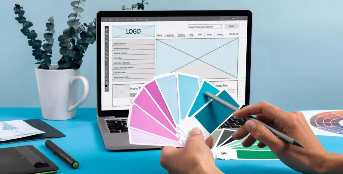
How to Choose the Right Colors for Your Brand
1. Know Your Audience
Different demographics respond to colors differently. For example:
- Younger users may prefer bold, energetic tones.
- Older audiences might appreciate softer, more refined shades.
2. Define Brand Personality
What traits does your brand embody?
- If you're fun and creative, go for bright and bold colors.
- If you're reliable and trustworthy, cool tones like blue and gray work best.
3. Understand Cultural Associations
Colors can carry different meanings in different cultures.For instance, white represents purity in Western cultures but is associated with mourning in some Eastern traditions
4. Consider Visual Hierarchy
Use color to guide attention, highlight CTAs, and support navigation flow in mobile apps, websites, and marketing creatives.
Role of Color in Different Design Projects
1. Logo Design
- Your brand’s first impression depends on color choice.
- A logo must be scalable, recognizable, and emotionally aligned with your audience.
- At Drenzi.in, we help businesses in Coimbatore and Tirupur develop memorable brand identities through color psychology.
2. Mobile App UI Design
What traits does your brand embody?
- Color influences how users interact and navigate your mobile app.
- Use contrast for readability, visual cues for actions, and consistency to build familiarity.
3. Marketing Materials
From brochures to social media creatives, color impacts how information is perceived.Our designers strategically apply eye-catching colors to drive click-through rates, engagement, and conversions.
4. Web Interface Design
A well-planned color palette increases time-on-site and reduces bounce rates.It supports brand trust, improves user journey, and boosts overall engagement.
Psychological Effects of Color Combinations
Color combinations can evoke deeper emotional layers. For instance:
- Blue + White = Trust + Clarity (Perfect for corporate websites)
- Black + Gold = Luxury + Prestige (Used by high-end fashion brands)
- Green + Brown = Nature + Earthiness (Ideal for organic and eco brands)
- Red + Yellow = Energy + Cheerfulness (Popular in food and fast service industries)
These tools allow us to test, adjust, and perfect color choices across all brand assets.
Why Businesses in Coimbatore & Tirupur Drenzi.in Trust for Graphic Design
Our approach is data-driven yet deeply creative. Whether it’s a textile brand in Tirupur, a tech startup in Coimbatore, or a healthcare provider in Tamil Nadu, we ensure your colors reflect your values and capture attention.
- Professional branding solutions
- Expert color psychology analysis
- Customized UI/UX color strategies
- Design consistency across platforms
- Multilingual and regional customization
Colors speak louder than words. They can persuade, comfort, excite, or reassure, depending on how you use them. In the realm of graphic design, understanding color psychology is essential to building a visual identity that connects and converts.
At Drenzi.in, we go beyond design, we create experiences. With expert knowledge of color psychology, branding, and visual communication, we help businesses across Coimbatore and Tirupur craft designs that truly resonate.
Let’s Color Your Brand with Meaning
Let our expert design team at Drenzi.in create graphics that are not only beautiful but strategically effective.